Happy Hump Day!
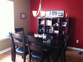
FINALLY!!! We got the shelf from IKEA that I wanted so badly. It wasn't too $$, got it for $129. I love it!! It = more storage space, and I like that! Our dining room is "NYC" as you may know from the house tour , so we keep thinking up ways to "NYC" it more. I liked the idea of the shelf (over a huge pic, because do have a huge pic right across the room in "London" - it'd be too much BIG art!) because in NYC its all about using the space you have - in those tiny apartments where everything has to flow AND work...this shelf helps us use the space more. Especially because all our mail and cookbooks were piling up here:
We are moving this white shelf down in the craft room (and Frodo's ugly kitty condo) and replacing it with a much sleeker, nicer "launching" pad set of furniture. I love what Young House Love has going on in their hallway with their entry table, we want to copy it, you can see a pic of that here. We like the clean look of this entry ensemble, as well as the little cubes that can be used as extra seating if need be. I know I know, we have that huge red couch (Clifford) but sometimes we do need the extra seating if we have enough people over (Ravens games, Christmas parties, etc). Anyways, we want to do something like this for that space. But on to the shelf...gotta love that IKEA...
Here is Dave, putting it together - don't worry, I helped too.
This is a pic of it all put together and me starting to fill it up!! We can tuck away all our mail in those little cubes, and also art/homework supplies in another, and my coupon stuff and flyers in yet another, we lots of space still for pictures and other decor.See my Home Management Binder and my Recipe Binder, tucked into their new home?
And I love that I have lots of space for cookbooks too, I have a lot and now I can get even more!
We are still playing around with what-goes-where and somethings here won't live here permanently, I need to find more NYC-ish things, maybe some art, etc to go on here. I don't want it to look too cluttered, but I want the use of the space to make sense for us too. Its going to be all about finding the balance:)
It tones down that red wall too. The pic sitting on top may not stay there. I have a project brewing for the top of this shelf, something to add more "oomph" to the space and put more color into the room - its so black and red right now and I want some accent colors going on in here! Hint: the project involves Modge Podge - good times!!
So that's my shelf that I've been dreaming of for months now, finally sitting in my NYC dining room. Life is good:)


I loooooove it! And I love that you named your couch Cliffard! Hilarious! Looks like you could fit another shelf that size, two side by side. Do you think you'll ever do that? Do you think it would be too much? I like the picture over top, if you move it, whereabouts will you move the picture? Looking forward to the entryway redo =)
ReplyDeleteCrystal
I have one of those in my basement and LOVE it. I think the design is so nice and sleek. Very good choice!!!
ReplyDeletexoxox
Jen
I love that shelf too! Have wanted one for a while too!
ReplyDeleteThanks for linking up to Making It With Allie last week! I can't wait to see what you have for this week!
AllieMakes.Blogspot.com